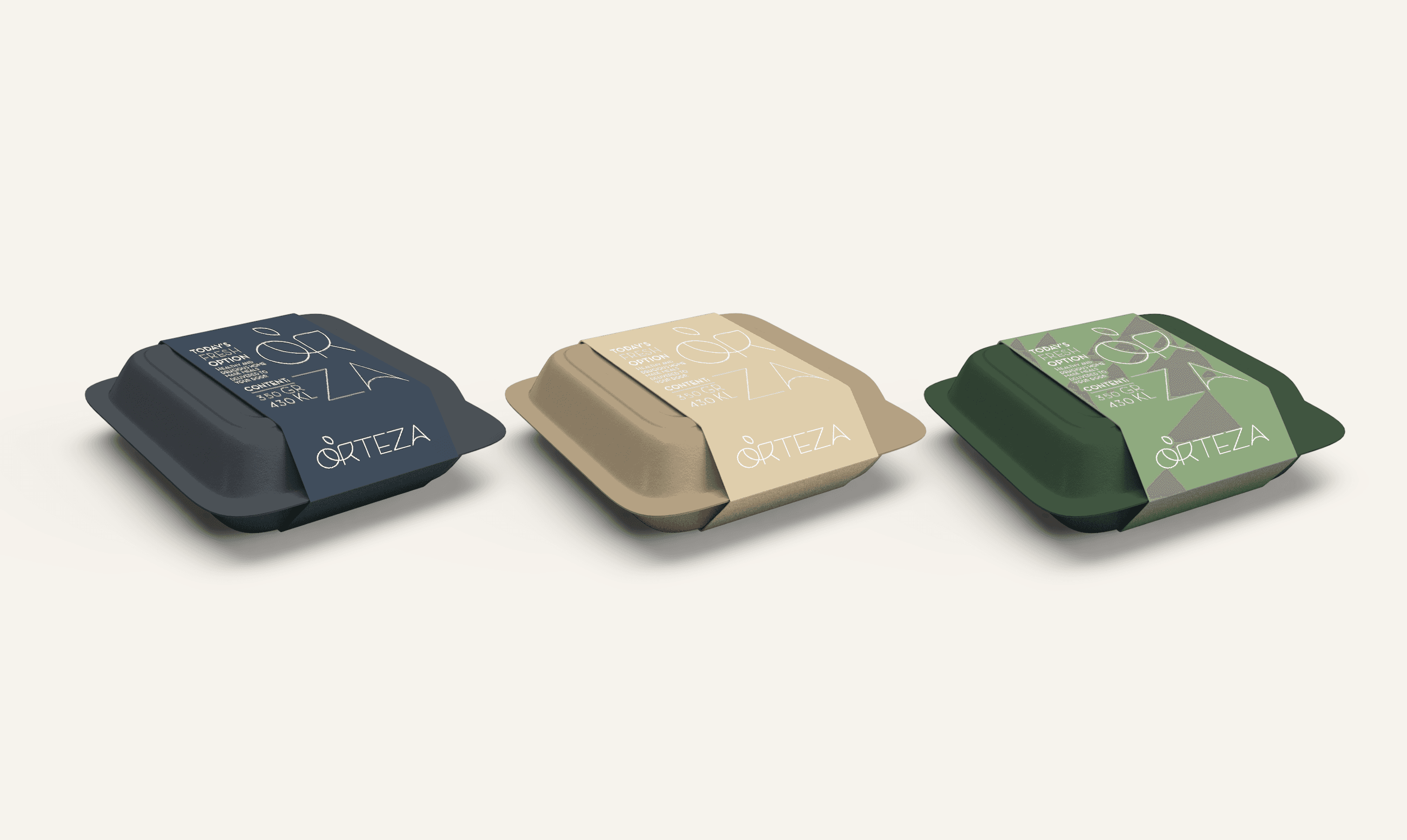
Rooted in Nature
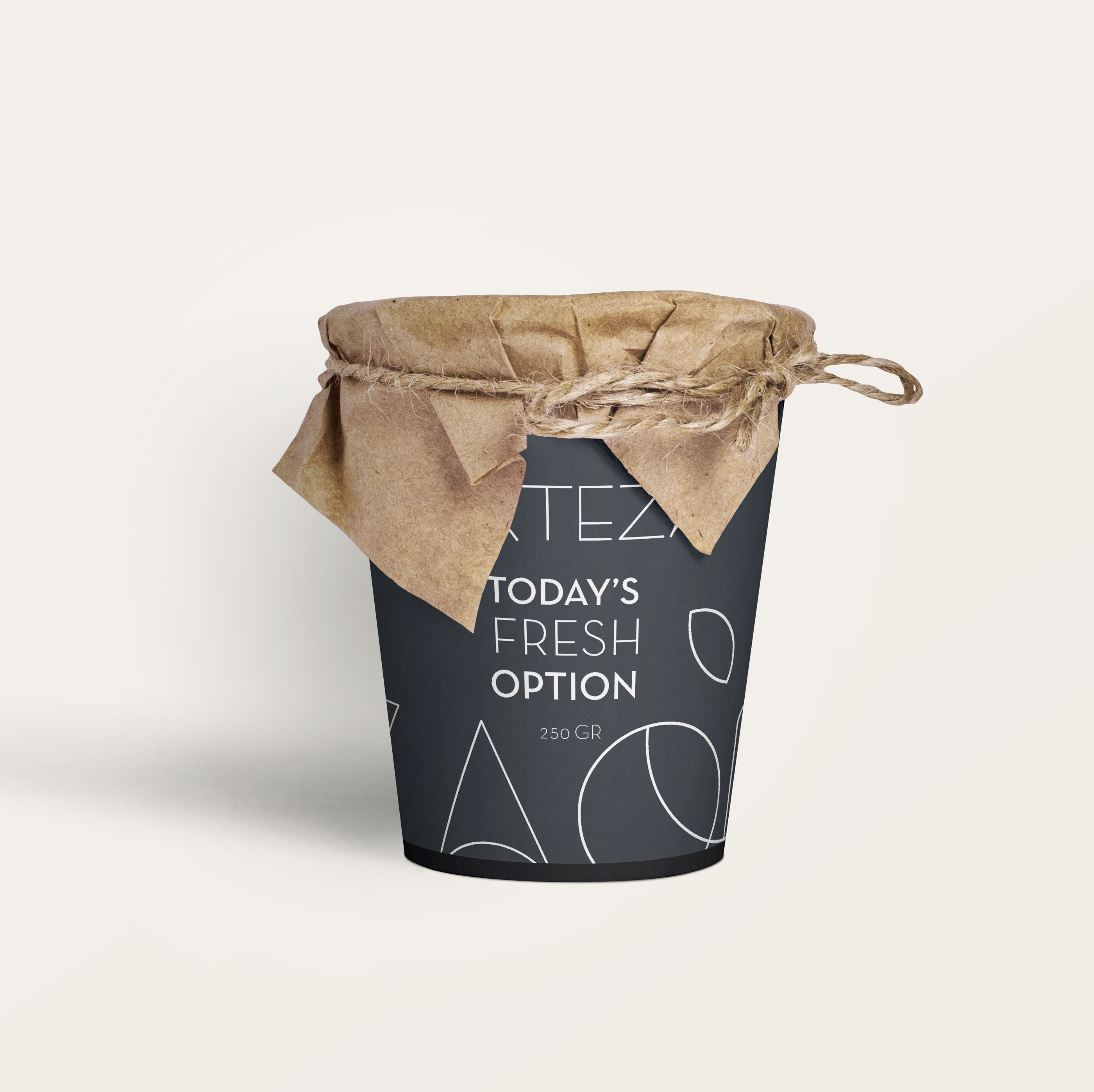
Services
Branding, Packaging
Client
Orteza
Year
2020
Sustainable food packaging often leans on green-and-leaf clichés to signal "eco-friendly." Orteza needed something that felt more honest than that — considered, warm, and a little more grown-up.
Kraft paper, a muted charcoal-tan-olive palette, and a minimal line-art mark with a small leaf detail carry across everything from takeaway boxes to tote bags — simple, earthy, and unmistakably Orteza wherever it shows up.